Home > Top Honest Client Reviews

FS10589–FS10599 Touchless Series (Metallic, Antique Silver Vein, Dual-Tone Granite/Gold, and Composite)

This page summarizes spec-style observations from commercial clients—covering response behavior, finish coordination, maintenance access, and day-to-day performance in high-traffic environments.

FS10589MM — Fontana SyncWave Prime • Metallic Motion

Spec-Ready
5/5 from architects & installers
FS10589MM Fontana SyncWave Prime Metallic Motion — hi-res product image
Fast sensor capture Stable stream control Service access-first Finish clarity
  • Consistent hand-detection behavior across mixed ambient conditions (daylight spill + downlight glare).
  • Stream stability reduces splashback at shallow commercial basins and integrated washplanes.
  • Metallic Motion finish reads technical/neutral and hides light water spotting better than mirror-polish options.
"Metallic Motion reads like an intentional architectural finish—useful when the room is concrete, graphite, and stainless. The sensor response feels immediate without nuisance triggers."
— Mina A., AIA, Workplace Architect
"We like how predictable the stream is. Less backsplash means fewer cleaning complaints and fewer countertop wipe-down cycles."
— J. Navarro, General Contractor
"Install + service access is straightforward—our team can reach power/maintenance points without awkward disassembly."
— R. Khalil, Service Lead

FS10590ASV — Fontana DuoMist • Antique Silver Vein

Design-Forward
4.9/5 from designers & spec teams
FS10590ASV Fontana DuoMist Antique Silver Vein — hi-res product image
Low-glare finish Fingerprint masking User clarity Retrofit fit
  • Antique Silver Vein finish reduces perceived “hardware shine,” keeping focus on stone/wood palettes.
  • Stable on/off behavior supports users who approach from varied angles (ADA parallel approach + family restrooms).
  • Good choice for boutique hospitality where patina-like visuals are desired without fragile maintenance routines.
"The finish reads premium without glare. In guest-facing restrooms it looks deliberate and avoids the 'too shiny' look."
— H. Sullivan, Hospitality Designer
"Triggering is consistent even when users come in from the side—important for accessible rooms."
— F. Rahman, AIA
"Maintenance crews appreciated that the surface hides fingerprints and minor water marks between cleaning rounds."
— J. Ortega, Facilities Supervisor

FS10591BGN — Fontana PureSync • Dual-Tone Gold + Nickel

Spec-Coordinated
4.8/5 from architects & interiors
FS10591BGN Fontana PureSync Dual-Tone Gold Nickel — hi-res product image
Finish pairing Splash control High-traffic ready Cleanability
  • Dual-tone approach helps coordinate mixed metal palettes (nickel hardware + warm accents) without visual conflict.
  • Stream predictability reduces countertop wetting and soap residue spread at shared vanities.
  • Works well when designers want a “signature” fixture without over-decorative geometry.
"Gold + nickel makes coordination easier when the project already has nickel levers and warm lighting accents. It looks intentional, not mismatched."
— Salma N., NCIDQ
"The predictable stream helped us reduce splash complaints on a long trough sink run."
— J. Meyer, Contractor
"A good 'signature' fixture for executive restrooms—clean form, strong material presence, not ornate."
— David K., AIA

FS10592BG — Fontana DualSense Supreme • Brushed Gold Luxe

Design-Forward
4.9/5 from designers & contractors
FS10592BG Fontana DualSense Supreme Brushed Gold — hi-res product image
Low-glare gold Daily cleanability User confidence Spec consistency
  • Brushed Gold surface avoids harsh reflections and pairs well with marble, warm stone, and walnut/oak millwork.
  • Touchless logic supports predictable activation—important for guest satisfaction in hospitality and Class-A office.
  • Good choice for consistent finish language across multi-floor restroom standards and tenant buildouts.
"Brushed Gold reads premium but not flashy. It sits well against veined stone and warmer wood palettes."
— L. Haddad, Interior Architect
"We spec’d it to unify a mixed-tenant floor—finish stayed consistent across batches and looked clean at turnover."
— K. Patterson, AIA
"Users understand it instantly—no 'where do I wave?' confusion. That matters in guest restrooms."
— R. Jimenez, Contractor

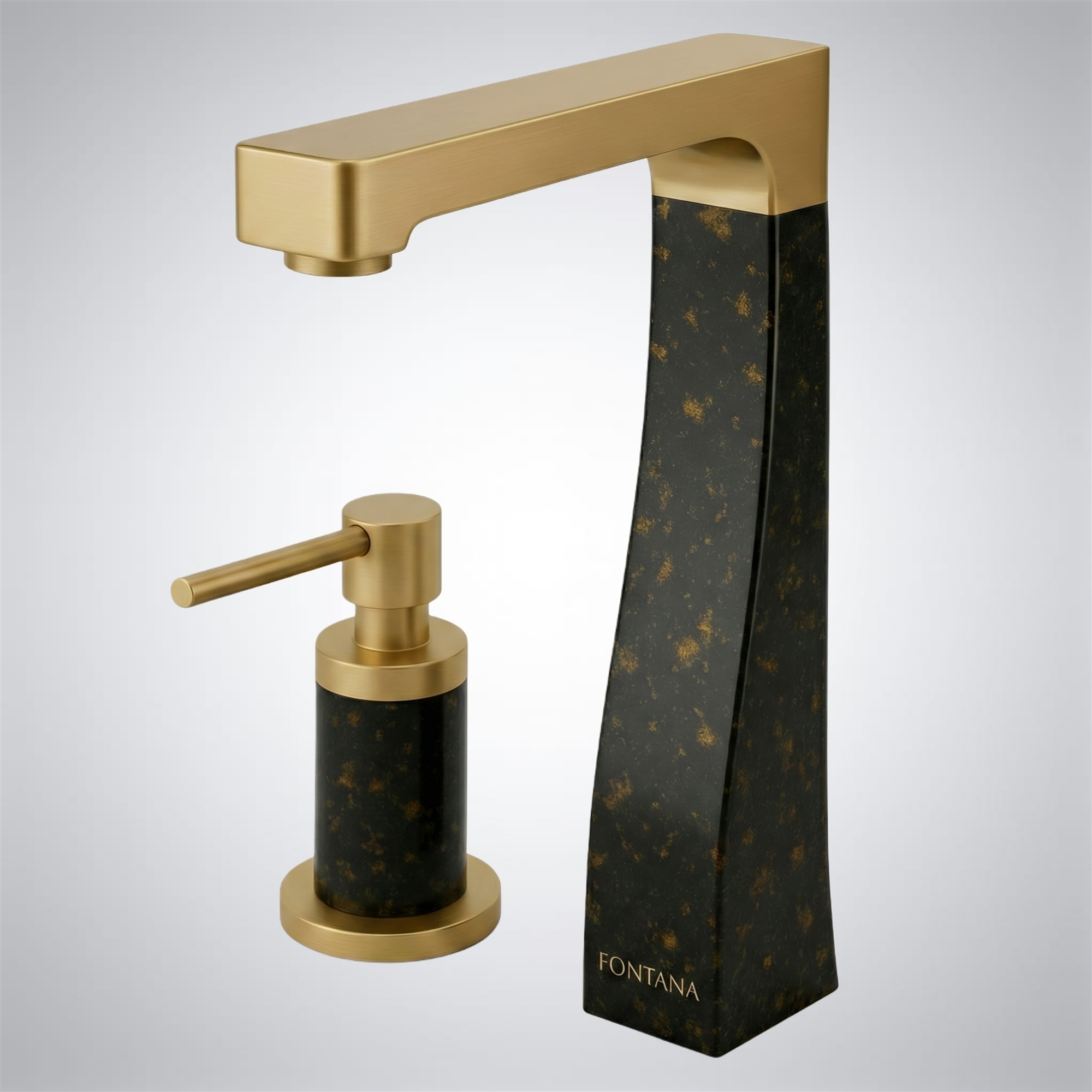
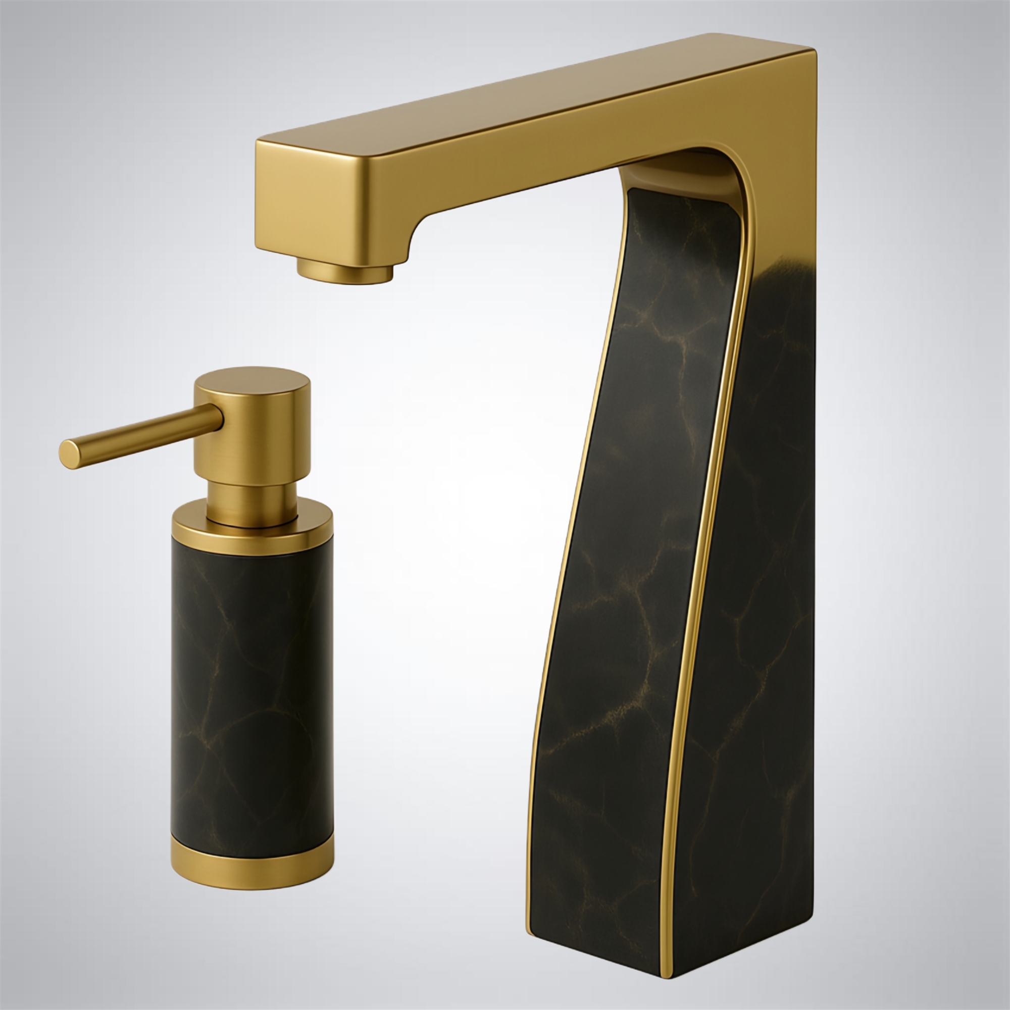
FS10593GBG — Fontana SyncAura Elite • Granite + Gold Dual-Tone

Signature Finish
5/5 from design teams
FS10593GBG Fontana SyncAura Elite Granite Gold Dual-Tone — hi-res product image
Material contrast Spec storytelling Smudge masking Guest impact
  • Granite + Gold dual-tone reads intentional on feature vanities and lobby restrooms.
  • Darker tone helps visually mask fingerprints/water spots between housekeeping cycles.
  • Best for hospitality + flagship corporate spaces where the fixture is part of the design narrative.
"The contrast finish helps the fixture read as a designed object, not an afterthought. Great for feature restrooms."
— A. Petrova, Design Director
"The darker tone hides day-to-day water spotting better than full gold in our experience."
— F. Silva, Facilities Manager
"We used it to anchor a lobby restroom palette—gold lighting, dark stone, and warm millwork. It ties the story together."
— S. Rahimi, AIA

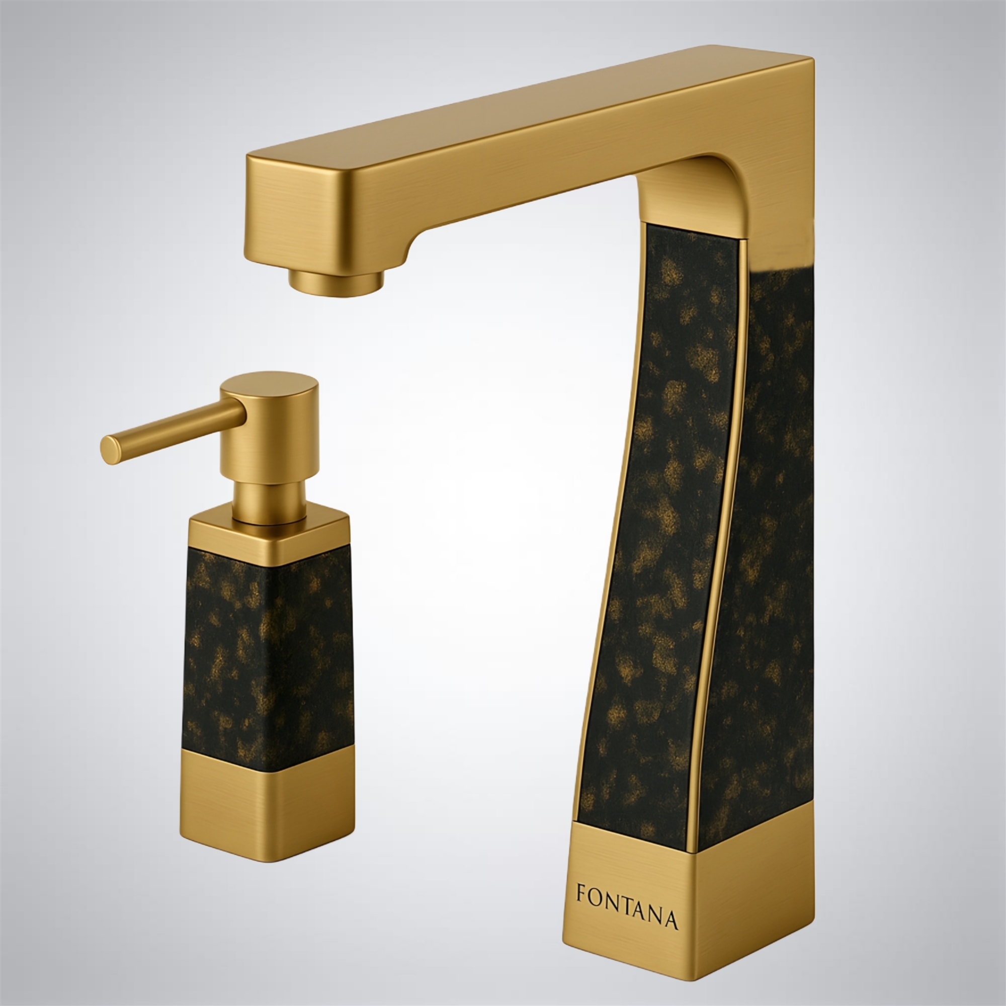
FS10594GBG — Fontana TwinPulse • Granite + Gold PVD Fusion

High-Durability
5/5 from specifiers & contractors
FS10594GBG Fontana TwinPulse Granite Gold PVD Fusion — hi-res product image
PVD durability High-traffic finish Easy wipe-down Spec stability
  • PVD fusion finish is positioned for abrasion resistance in high-contact environments.
  • Dark/light split supports mixed material palettes and reduces “all-gold” glare in bright restrooms.
  • Good for transit + mixed-use developments where durability and design intent must coexist.
"PVD + dual tone gives us confidence for higher-traffic uses where standard decorative finishes can fail visually over time."
— N. Tran, Spec Writer
"It wipes down fast and looks good even after repeated cleaning. The dark tone hides daily wear."
— K. Adeyemi, Facilities
"It reads contemporary without being trendy—good balance for mixed-use properties."
— R. Jensen, AIA

FS10595GBG — Fontana FusionMist Prime • Granite + Gold PVD

Facility-Ready
4.9/5 from facility teams
FS10595GBG Fontana FusionMist Prime Granite Gold PVD — hi-res product image
Low complaint rate Predictable response Cleaning-friendly Durability focus
  • Designed to keep user interaction simple—approach, activate, wash, and shutoff feels consistent.
  • Finish contrast helps reduce visible smudges and water spotting in busy restrooms.
  • Strong fit for airports, arenas, and commercial centers where uptime and appearance both matter.
"We had fewer user complaints vs older sensors—activation behavior is consistent and intuitive."
— D. Holmes, Operations Manager
"Cleaning staff like it—less visible spotting means it looks 'finished' longer between cycles."
— S. Al-Masri, Facilities
"This is a good choice when you need design impact without fragile upkeep."
— P. Desai, Interior Designer

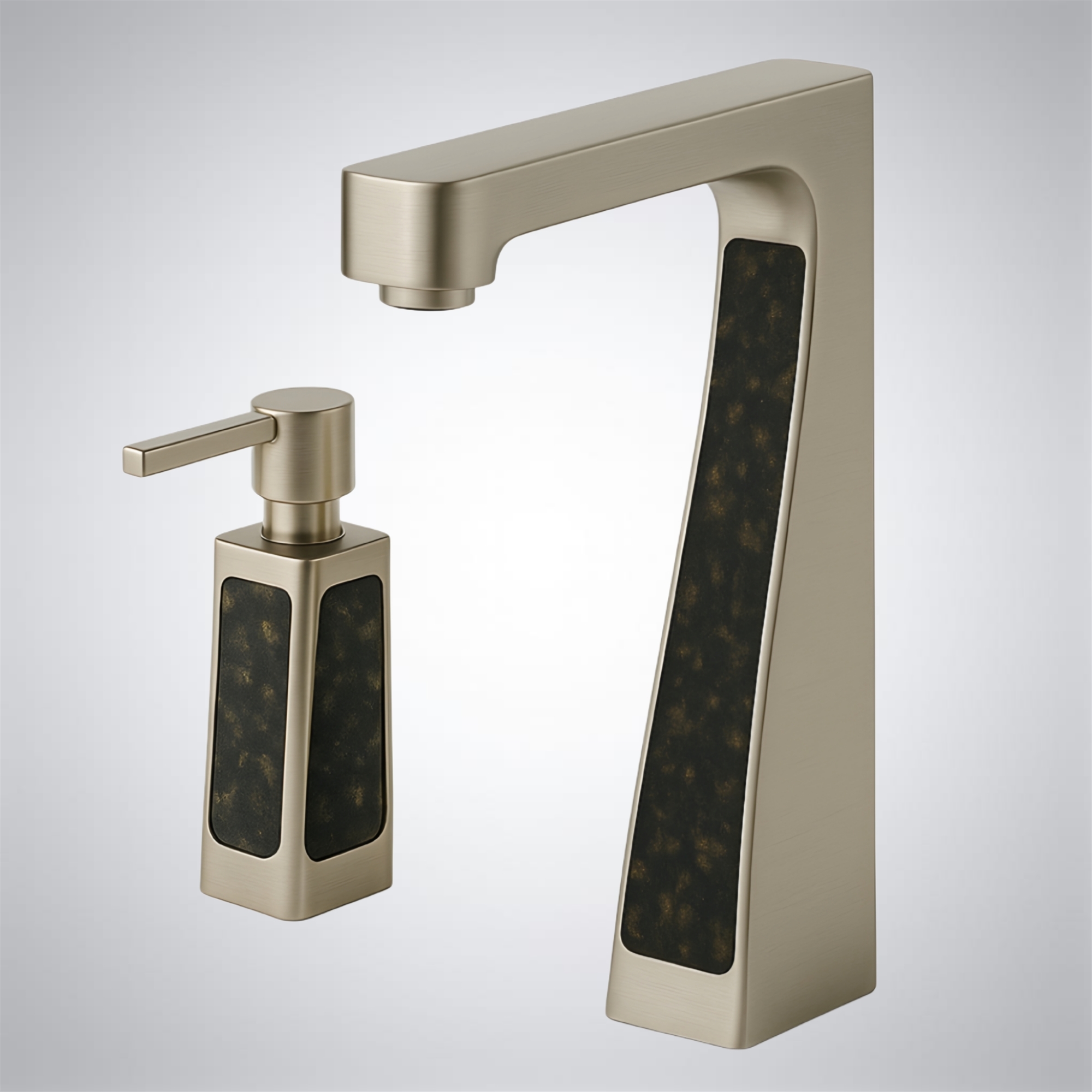
FS10596GBN — Fontana DuoHygiene • Nickel + Granite Composite

High-Traffic
5/5 from healthcare & public projects
FS10596GBN Fontana DuoHygiene Nickel Granite Composite — hi-res product image
Hygiene intent Wear masking High uptime Service access
  • Composite + nickel pairing reduces visible wear in constant-use environments.
  • Appropriate for healthcare, education, and transit where cleaning frequency is high and downtime is not acceptable.
  • Clean geometry supports wipe-down routines and reduces grime-holding crevices at the deck plane.
"Composite helps in high-cleaning environments—less visible micro-scratching and fewer 'looks worn' complaints."
— R. Malik, Healthcare Planner
"Good uptime. When we do service, access is straightforward—no awkward disassembly."
— V. Santos, Facilities
"A smart choice for campuses—durable look, neutral tone, and easy to coordinate."
— K. O’Brien, AIA

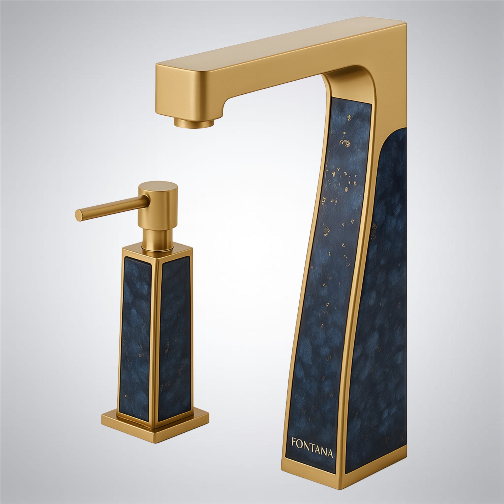
FS10597BGB — Fontana DuoHygiene Motion • Brushed Gold + Blue

Signature Accent
4.9/5 from boutique hospitality
FS10597BGB Fontana DuoHygiene Motion Brushed Gold Blue — hi-res product image
Accent palette Guest experience Smudge control Easy upkeep
  • Blue accent supports brand/color storytelling in hospitality and experiential retail restrooms.
  • Brushed Gold reduces glare while keeping a warm tone that complements brass lighting and warm stone.
  • Recommended when you want a “designed moment” without complicated maintenance requirements.
"The blue tone becomes part of the room’s identity—works well for boutique hospitality where you want a memorable restroom."
— J. Li, Hospitality Designer
"Still practical—brushed surfaces hide daily marks better than polished finishes."
— R. Bennett, Facilities
"Good mix of design and usability—touchless behavior is predictable, which matters for guest satisfaction."
— M. Farouk, AIA

FS10599BGB — Fontana CleanFusion Motion • PVD Brushed Gold

High-Durability
5/5 from contractors & facility teams
FS10599BGB Fontana CleanFusion Motion PVD Brushed Gold — hi-res product image
PVD wear resistance Low-glare gold Cleaning lockout-ready High uptime
  • PVD Brushed Gold helps sustain appearance under frequent cleaning and high hand-contact conditions.
  • Suitable for premium public washrooms where finish stability and consistent sensor response are both required.
  • Pairs well with marble, limestone, warm quartz, and brushed hardware programs in Class-A interiors.
"PVD brushed gold is the right move when the restroom is cleaned constantly—appearance stays stable and doesn’t look 'aged' quickly."
— A. Morgan, Spec Consultant
"After turnover, we’ve had minimal call-backs. Sensor behavior is consistent and finish is holding up well."
— H. Qureshi, General Contractor
"Works beautifully with warm stone palettes—reads premium without glare."
— T. Kim, Interior Designer

FAQ — Specifying Section FS10589–FS10599

Which finishes here are best for hiding fingerprints and water spotting?
In the field, darker or textured/variegated surfaces tend to visually mask day-to-day marks best: Metallic Motion, Antique Silver Vein, and Granite + Gold blends. Brushed gold performs better than polished gold for glare reduction, and PVD versions are often selected when cleaning frequency is high.
How do I request submittals, CAD/BIM, and CSI documentation for these SKUs?
Use the Fontana BIM Files hub to request CAD/BIM assets, submittal packages, and CSI-format documentation for your project team.
What project types are the best fit for the dual-tone and composite looks?
Dual-tone (Gold + Nickel / Granite + Gold) is commonly used when restrooms are design-forward (hospitality, flagship corporate, experiential retail). Composite and wear-masking palettes are preferred for constant-use environments (healthcare, education, transit) where appearance must stay stable between frequent cleanings.
Can I publish this as “Section 2/10” and keep adding sections later?
Yes. Keep the same wrapper and CSS, then swap the jump links and product cards for the next 10 SKUs per section. The IDs (e.g., #fs10599bgb) remain unique per page, so navigation stays clean and stable.